Darkroom

WHAT PAPER DEVELOPER ARE YOU USING THESE DAYS?

AmidolSo. . . everyone has their preferred brands, methods, techniques and such. I have mine for sure. As Fred Picker said, “if you have been around for twenty years or more and haven’t formed any opinions, what have you been doing?” I miss Fred!

There seems to be a lot of paper developer formulas floating around. My wife and I have tried our share of so-called ‘magic’ formulas. We have been down the Amidol road, and don’t get me wrong, Amidol is a great developer but it is far from magic. Amidol is about the best I have found for Azo. Yes we do print on Azo, in fact, we have a stock of it on hand. I would just like to go on the record as not being a person that subscribes to the idea there are magic bullet formulas. There is what works for you and that can be anything that suits your way of seeing. Anyone that has a one-size-fits-all attitude, usually has something to sell.

We have had our frustrations with Amidol developers. And I am not convinced that it is the best, certainly not the only, developer suitable for Azo or any other paper. In a side-by-side test my wife and I determined that Amidol was our developer of choice several years ago. There is a subtle edge there that is not something you can put into words, but there is a difference we decided worth exploring. But Amidol is expensive and can be frustrating to use at times. Yes, we have tried all of the popular formulas. I have just not been too impressed with the results I have obtained at times. What I was searching for was a cold-tone developer. Not only for Azo, but for the other printing papers we use. At times Amidol was still giving a green cast on Azo. Not bad but annoying and required lengthy toning in selenium to offset. I like a cold, neutral tone for most of what I print and the Amidol formulas just wasn’t consistent enough for me. I was not happy with how things were working. It was time to do some research.

I found a lot of interest on the Internet about a Pyro base paper developer formulated by Donald Miller. Mr. Miller named his developer Pyro Plus Paper Developer (PPPD) and after reading about this formulation I was inspired to give it a try. Believe me it takes some inspiration to get me to try something new, but I was frustrated with Amidol and I needed some good news for a change.

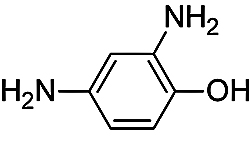
From all of the discussions about PPPD I found one thing was clear; there were numerous variations to the formula. The original published formula called for both Pyrogallol and Pyrocatechol. Now this is where things get a little confusing. I don’t recall where I found the particular variation that I tried, but there was a suggestion from somewhere to replace the Pyrogallol with Citric Acid. Not sure where I found that, but that was the formulation that I first tried.PPPD-JBH

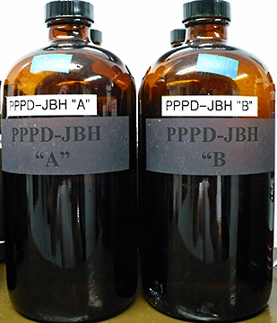
From what I gathered, adding the Pyrogallol and changing the amount of Potassium Bromide makes a more warm-tone developer. I was not interested in warmer, I wanted a cold, neutral developer. To my surprise the variation I tried worked very well. It more than met my requirements, and so far, has yielded very neutral cold tone results on the Azo we have on hand. No more green tint, just what I wanted! It has also proven to be excellent with all other papers we use. And, for those that are economy minded, Pyrocatechol is much cheaper than Amidol.

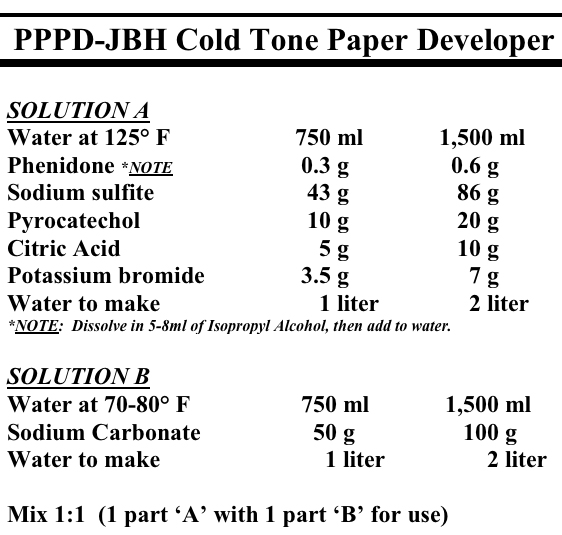
PPPD keeps very well in an open tray once mixed, but should be dumped at the end of a printing session. I have never had it to die in the tray from oxidation. It does die from exhaustion, just like most any other developer. I would estimate that after about twenty 8×10 prints per liter, you should start looking to mix some fresh developer.

This particular formula also keeps well as a premixed two-part stock solution. Part ‘A’ is mixed 1:1 with part ‘B’ for use. I found that by mixing one liter of both part ‘A’ and part ‘B’ and storing it in full brown glass bottles it keeps at least six months. At least at this point in my experiments that is as long as I have stored the stock solutions. I keep three to four one liter bottles mixed and on the shelf in the darkroom. When we go to print, you just dump a bottle of part ‘A’ and part ‘B’ into a tray and away you go.

I really like this developer and my wife is using it also. So if I am asked what developer I am using, I say now days it is my variation of Donald Miller’s PPPD. My bottles are marked PPPD-JBH for my personal favorite formula.

Oh. . . almost forgot. . . I guess if you have read this far you are interested in the version of PPPD we are using.  Here is the formula that we have found to work very well with every paper we use, including Azo. Maybe it will work for you. . . maybe not. The only way to find out is to, as Fred Picker would say, “TRY IT!”

PPPD-JBH Formula

Please note that this developer contains chemicals that could be hazardous. Practice safe handling procedures when mixing chemicals. Wear gloves or use tongs when working with PPPD. In fact, it is a good idea to wear gloves when using any print or film developer.

Keep in mind this is a cold-tone developer. If you search the Internet you will find more information on other variations of the PPPD formula. Supposedly adding Pyrogallol and varying the amount of Potassium Bromide makes this a warm-tone developer, but I have not tried it, since I was not interested in warmer print tone.

I would like to personally thank Donald Miller, and all the others involved for laying the groundwork and publishing this formula, and its numerous variations, for Pyro Plus Paper Developer. Anyone wishing to experiment with PPPD, or seeking more information, try an Internet search for Pyro Plus Paper Developer.

Here you will find the original Pyro Plus Paper Developer formulated by Donald Miller;

http://unblinkingeye.com/Articles/PyroPlus/pyroplus.html

JB

Posted by JB Harlin in Darkroom, Formulas, Photography

SPOTTING MICROSCOPE

MICROSCOPE

If you are like me, you really hate having to spot prints. You especially do not like spotting negatives. I struggled for years trying to come up with a good way to spot prints. The problem is getting a good look at what you are working on, with enough detail to accurately guide that hair-fine spotting brush to just the right spot. I used a loop. . . tried magnifying glasses. . . used a magnifying viewer for some time, but nothing gave me a really good view of what I was working with.

MICROSCOPE

Somewhere along the way someone suggested using a stereo microscope. What a stroke of genius!

After doing some research it became clear that a high-quality inspection microscope, with magnification in the 8x to 10x range was prefect for spotting both prints and negatives. A good stereo microscope with zoom was exactly what is needed. The ideal setup would have a long boom stand so you can swing the head out over the work area, and for spotting prints you need an illuminator. I was able to find an entire microscope package including a zoom stereo head, eyepieces, long boom stand with heavy base, and illuminator on eBay.

The microscope head that I have has a zoom range of 0.70 to 3.00 x. Using a set of eyepieces that are 10x, I have a zoom range of 7.0 to 30.0 x. This is perfect! Most of the time 7x is fine, but if I have a really tiny pinhole I can zoom in even more. The microscope illuminator is necessary for working with prints, while you will need a light box for working on negatives. This is why you need a good, adjustable, boom with a heavy base.

It takes a little getting used to, but a stereo microscope is the Rolls Royce of spotting magnifiers. Well worth the expense. This type of microscope setup is used in manufacturing quality control to inspect small parts and comes up in the used market frequently. Searching out a good microscope will save you a lot of headaches and make that unpleasant chore of spotting a little more tolerable.

JB

Posted by JB Harlin in Darkroom, Film, How-To, Photography

THE PYRO-CAT IS OUT OF THE BAG

Film TestingBack in February 2009 I posted an entry titled “WHO USES PYRO?” and ended it with this statement, “I have about reached a conclusion as to which formula best suits what we do. . . and. . . I may just write about what I found at a later date. . .”

One thing I can say for certain is that for us, and let me be very clear about this, I repeat, FOR US and the way we work, most any staining developer out performs any non-staining developer we have used. It was just a matter of finding the right developer that suited us and one that would allow us to produce prints that have the presence and feel that best suits our vision.

PyroCat HD

After working with several of the more popular staining film developer formulas we have finally chosen our favorite. There was a lot of research and comparisons, followed up with field testing in order to ascertain what best fit our needs. I defined the main criteria and judged each developer on how well each performed in each area. Here is a short list of the main points:

• the formula had to be published
• we considered how we work
• what we expect from the negative and developer combination
• ease of use
• consistency of the developed film
• stability of the developer formula
• stain color
• general stain and stain density
• the look, feel, and overall print quality
• last, but not least, the cost

I prefer to always be able to mix my own chemicals from scratch. This became my first issue, since I do not want to depend on the availability of the developer from an outside source. I am a strong believer in vertical integration. Also, if I want, I can modify the formula, and I always know who to blame if something goes wrong.

One thing I have learned is that Pyrogallol is cranky. Nearly all of the formulas we tried that were based on Pyrogallol, at one time or another, under certain circumstances, gave inconsistent and sometimes unpredictable results. The problems could have been caused by any number of variables. We tray process all sheet film using the shuffle method. Some of the Pyrogallol formulas showed signs of aerial oxidation in the tray at the end of the developing cycle, while others did not. The biggest problem was that every Pyrogallol formula we tried, performed erratically and at one time or another, produced an occasional unevenly developed negative. One formula was especially sensitive to wash time. The longer you left the film in the washer, the more the general stain increased and the film went from a near neutral color to deep green. Never did understand what caused that. I am sure it was something that I did, but I do not like to have to deal with something that is that sensitive to slight variations of process.PyroCat HD

PyroCat HDOne thing I did learn was that Pyrocatechin is a much more stable and user friendly developing agent. The Pyrocatechin formulas showed little to no aerial oxidation in the tray after a processing run. No matter what I did, the negatives have not shown any uneven development or any other problems. I prefer to have the confidence that even if something is a little different during processing, it will not cause inconsistent results with the finished negative. In other words, I like to have a little wiggle room.

One other quick observation has to do with the general stain color. I know there has been a lot of discussion about the stain color and again this is what we have found to work best for us. Through our experimentation we quickly learned that green negatives do not work well for us. We print on numerous different papers, and use both graded and variable contrast materials. There is no one magic paper! The right paper is the one that works for any particular negative you are printing. We have found, that for us, the more neutral to brown stained negatives work the best. That is just us. . . if you find otherwise, then use what works for you.

With all of that behind us and a notebook full of test data, I can say it is time to stop the experimenting and get on with what is important, creating photographs. We have now chosen our favorite standard film developer. Pyrocat HD by Sandy King has proven to be the best choice for the way we work. What else can I say. It works. . . works consistently. . . and meets all of our expectations.

I would like to thank Sandy King for all of the research and work he has put into this formula. If you are not familiar with Pyro developers and Pyrocat HD, click HERE to learn more.

JB

Posted by JB Harlin in Commentary, Darkroom, Film, Formulas, Photography

COOL WHITE. . . MAN

Seem things continue to change at an alarming rate. Several years ago, maybe 12-15 to be honest, I bought some supposedly daylight balanced fluorescent lamps for the kitchen fixture. They put out this really annoying, kind of brownish light that I just could not stand. They were eventually banished to the garage where they finally burned out and were discarded. It was back to the old standard Cool White fluorescent lamps and that awful color cast they generate. Fast forward to our current world and I saw some information about a Compact Fluorescent (CFL) lamp that is 5,000k and touted to be Full Spectrum. Wow! Now that is more what I was looking for.

I bought a CFL lamp that is dimmable, 5,000k and Full Spectrum for another project I was working with. I was so impressed with the light that I searched out some four footers for the kitchen fixture. Once installed I was really impressed with the fact that the room no longer had that sick green/blue light I have become so accustom to from the run-of-the-mill Cool White lamp. The kitchen light looked so good compared to the ones in the darkroom, I knew they were next.

I did take the time to look at a few photographs under both lights and the difference is remarkable. It is always difficult for me to judge print color cast under fluorescent light. These new Full Spectrum lamps deliver a much more natural light that I really like. If you haven’t looked into these new generation lamps, you might just get a pleasant surprise.

Little else to say, other than the latest batch of Full Spectrum fluorescent lamps are impressive and I really do not want to go back to Cool White. . . Man!

JB

Posted by JB Harlin in Commentary, Darkroom, Photography

DUST. . . A Four Letter Word!

3M field service vacuumYes, the number one adversary of the LF photographer is DUST! Dust is a four letter word in the world of photography. Seems we are always fighting Dust. It gets into everything. The one place you absolutely can not tolerate the pest is on your film. A tiny speck of dust or lint in your film holder will always find its way onto that one area of smooth even texture.

So, the question is how to battle dust? One thing to do is, as mentioned in my previous post titled “Wax On. . . Wax Off” is to wax your equipment. Waxed surfaces are easier to keep clean. Also, vacuum out all of your bags, cases and packs regularly. Before every outing, take the time to disassemble your camera and clean it. Remove the bellows and vacuum out all of the folds, inside and out.

Next comes your film holders. Before you begin loading, dust the table top. I like to go over the surface with a damp cloth just to be sure. Your best friend when it comes to your film holders is a good vacuum. We travel and have to deal with film loading in all sorts of, less than desirable situations. Our number one tool is a small portable vacuum.

I first saw these small commercial vacuums being used by copy machine techs years ago. The vacuum they carry is a small, self-contained, field service vacuum and the most popular seems to be one made by 3M. We searched around and bought a 3M SV-497AJM vacuum on that auction site years ago. One of the best purchases we have made for sure!

A little searching on the Internet turned up this from 3M, “Designed by 3M Corporation for its own office products service department, this durable, reliable vacuum cleaner set the standard for all others. Designed specifically for cleaning toner from copy machines, it also is great for cleaning printers, floors or just about anything else a field engineer might encounter.” The unit is self contained with hose and attachments housed in the top and is 17″ x 6.5″ x 7.5″ weighing 9 pounds.

Our 3M field service vacuum has logged many miles with us over the years and we would not consider travel without it. It is also great to have around the darkroom to help keep dust under control.
JB

Posted by JB Harlin in Darkroom, Film, How-To, Photography, Travel

WHERE DO I START?

The question comes up every now and again about getting started processing and printing B&W film in the wet darkroom. Seems that as more and more people come to photography via the digi-snapper route, they eventually become interested in that antiquated art form known as Film. I have said this so many times, have been cursed and belittled by some for my comments, but here it is again. Digital is not a replacement for film. It is simply another art form. There I have said it one more time. If you don’t get it, too bad. Get over it.Do It In The Dark

Now, back to the subject for today, how to get started processing and printing film in the wet darkroom. The question is, where and how do I start? What do I need? Is it hard to do? There are many answers to these questions. You can take a class, find a workshop, or study with someone that is willing to teach you. Or, my favorite method of doing anything. . . find a good book and learn on your own.

If you choose my method the next question is, what book? There are many good books on getting started with film. Also, there are a lot of good web sites on the Internet that will help you. My recommendation is to start where I did over thirty years ago. I found a great book that is geared to the rank beginner. This book does not outline anything that is set in concrete, but if you follow it you will process a roll of film and make prints. Wherever you go from there is up to you. This is where I started and I can say it worked the first time and though I do not use much of the techniques or materials in the book anymore, this was the launching pad for me to move to more advanced techniques. Some of the materials and chemicals are no longer available, specifically the chapters on color, but the basic B&W techniques still apply. This book is a bare-bones, get you started text.

OK. . . enough of my book review, time to get down to brass tacks. First I have to say that the book I recommend is long out of print. But, the good news is the title is readily available on the used market and it is not expensive. I found several copies on the Internet for $1.00! If you are interested in getting started in the wet darkroom, here is a good place to begin. It worked for me, I am sure it will work for you also. Here it is;

“DO IT IN THE DARK”
by Tom Burk
H. P. Books 1975
ISBN 0-912656-28-X

This is one place to start. . .

JB

Posted by JB Harlin in Darkroom, Film, How-To, Photography

THE VARIABLE CONTRAST COLD LIGHT

PAPER GRADEThe dual grid, Variable Contrast Cold Light head (VCCL), is a great device for your enlarger if you print on black & white VC papers. These heads allow you to dial in any contrast grade your VC paper is capable of producing. You have continuously variable contrast at your fingertips. And, yes they do work. The trouble is, every paper is different. Setting the dial on the head to any random equal setting may or may not produce a grade #2 contrast. Worse yet, what two settings should you choose?

When you start using a new VCCL head you are now faced with a quandary. How do you calibrate this thing so you have some idea what paper grade you are actually getting? Did you know you can calibrate a VCCL head to a known standard? You can know what settings of the blue and green grid will give you an equivalent grade #2, or #3, or anything within the range of the paper!

Yes you can calibrate a VCCL head, and here is how it can be done. Look at the article “USING BTZS TO CALIBRATE YOUR VARIABLE CONTRAST COLD LIGHT HEAD” originally published in the Sep/Oct 2007 issue of View Camera Magazine in the ARTICLES area of our web site.

Posted by JB Harlin in Darkroom, How-To, Photography

DON’T SCRATCH YOUR SINK

Darkroom Sink
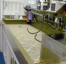
If you build you own darkroom sink or use a commercially available unit, you need something to protect the floor of the sink from scratches and abrasions. It has been a common practice to construct wooden Duck Boards for the bottom of the darkroom sink. These work well, they protect the sink, and allow water to drain, but wood is hard to waterproof and keep from warping.

I have heard of people using plastic lighting grids or plastic rods in the sink, but I have never tired them. I have constructed and used the usual wooden Duck Boards for years. Then I found something even better.

Dri-Dek® is sold as an anti-fatigue flooring for use in commercial work areas such as industrial manufacturing or commercial kitchens. It comes in 12” interlocking squares or rolls. This is a soft, flexible Vinyl that is perfect for the floor of a darkroom sink.

We installed Dri-Dek® in our sink two years ago and it has been an excellent investment. Water easily runs through and under the lattice work, it protects the sink floor, and it provides a soft, yet firm surface on which to work. Note, that the Vinyl does stain when exposed to some chemicals, like Amidol and Pyro, but it has remained flexible and I would not hesitate to recommend it to replace those old, warped wooden Duck Boards.

For more information about Dri-Dek® click HERE.

JB

Posted by JB Harlin in Darkroom, How-To, Photography

2010 ADVENTURES IN THE DARKROOM

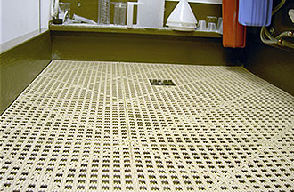
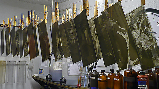
Time to start processing the film from the last trip to Utah. We spent 30 days on the road and photographed 20 days. That kind of working schedule generates a lot of LF and ULF film. Now comes the time to head to the darkroom for a little developing. Should take about 30 days to finish all of the film. Then we have to catalog and file, then proof to see what we have. Soon we will have some new film to start looking at with an eye toward making prints.

All film will be processed in a scratch-mixed Pyro developer, in small batches, by hand in open trays. Typically a day of processing will consist of 3-4 batches, normally totaling no more 30 sheets. We never try to push and do too many, if you get really fatigued, it is easy to make mistakes. This film is the culmination of hours of traveling and heaving heavy cameras in deep snow and ice, we do not want to do anything foolish now.

Hopefully we will find a few keepers in this batch of film. Watch here for more information and maybe a few new photos on the web site.
JB & Susan

Posted by JB Harlin in Darkroom, Film, Photography

THE SINK FINISH

SINK
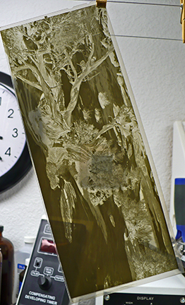
Once you become a serious darkroom worker you will eventually want a real darkroom sink with running water. The question is, to buy, or to build? Certainly, if you have deep pockets, you can buy a commercial stainless steel sink. You can even have a stainless sink custom fabricated. Just be forewarned, you are looking at a serious amount of money.

What most do is build their own sink, typically from wood. This is my favorite construction technique and allows me to build a very functional sink to any size required. In the previous post titled “NOT THE KITCHEN SINK” we showed what it took to build a large darkroom sink from wood. Robust construction is essential to make sure the sink does not flex. Flexing can cause the finish to crack and begin to leak.

My philosophy of sink building is to build the thing like a boat. Using construction robust enough to sail the ocean. That way it is strong enough to stand up to most anything. Once complete, I like to climb into the sink and jump up and down. If nothing moves, creaks, or breaks, I am satisfied that I have a good strong sink.

Waterproofing is the next order of business. Caulking all seams is a must to insure no leaks. Next comes some form of durable, waterproof coating. I built one sink years ago and used fiberglass. Never again! Way too messy for me, and I hate working with the stuff.

After much research I found a suitable coating for my darkroom sink. Tile-Clad® HS Epoxy is a two-part, commercial-grade, epoxy-polyamide coating from Sherwin-Williams. This epoxy paint is used in power plants, offshore structures, schools, storage tanks, laboratories, hospitals and marine applications. This stuff dries rock hard and is near impervious to most chemicals.
I have found that two generous coats of Tile-Clad® makes a great smooth waterproof finish for a darkroom sink. You can also have the paint tinted to most any color you desire. Most any Sherwin-Williams store should have Tile-Clad® and be able to tint it for you. Be prepared, this material is not cheap. Seven years ago when we built our last sink it was about $110.00 for a gallon of part ‘A’ and part ‘B’ which, when mixed, makes two gallons of paint.

The main points to keep in mind when building a darkroom sink is make it robust in construction, waterproof, and resistant to chemicals. Whatever finish you choose, whether it be fiberglass or Tile-Clad®, if the sink flexes, the finish will crack. Build your sink like your life depends on its integrity and you will never have leaks nor have to build another. . . unless. . . you decide you need a larger one!

For those interested in why we chose this chocolate brown color, the first sink I built was white. Amidol and Pyro left stain spots all over the sink. We chose the closest color to the stains from the color swatches from Sherwin-Williams and had the paint tinted that color. Developer stains do not show!

BUILDING A DARKROOM SINK

JB

Posted by JB Harlin in Darkroom, DIY, How-To, Photography